the brand
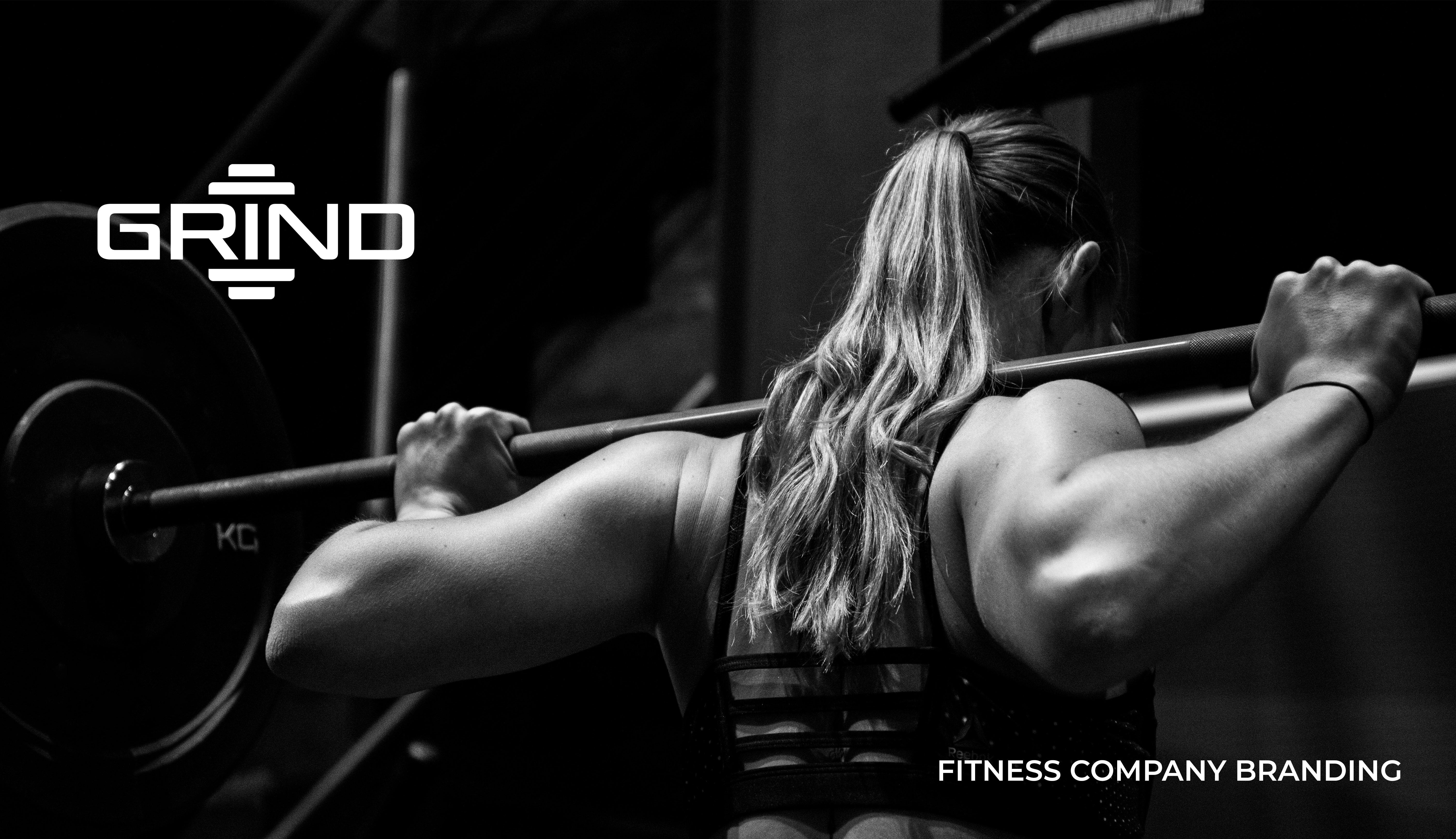
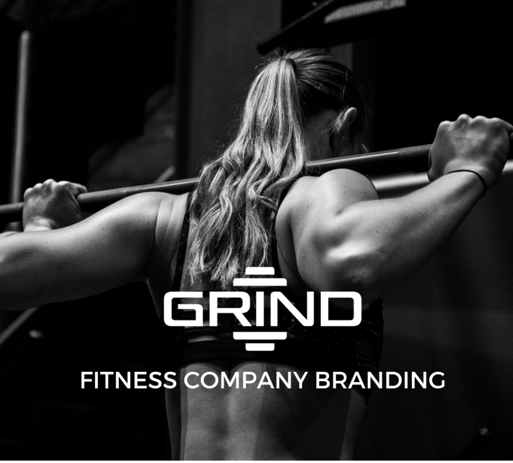
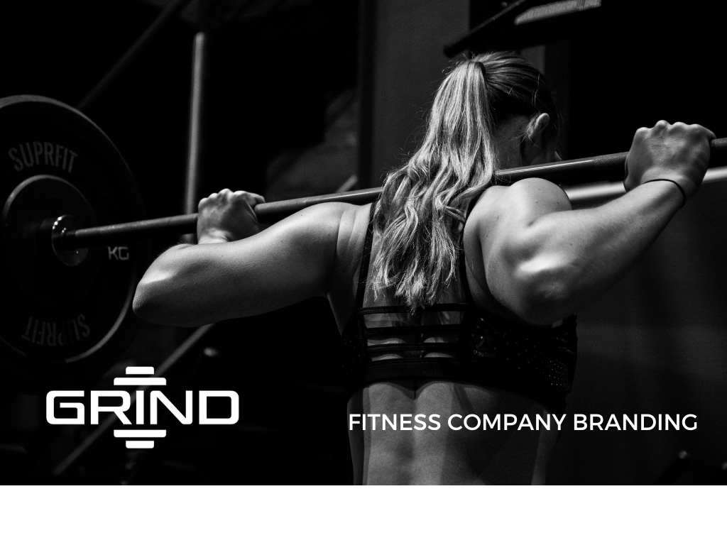
Grind is a conceptual personal training company that facilitates a rigorous environment to inspire customers to achieve their fitness goals. The company boasts of its dedication to customer success. The trainers connect with their trainees on a personal level and are genuinely concerned about their well-being.
The Logo
The Grind logo has a bold look that insinuates strength and empowers customers. The rounded edges on the type show movement and mimic the shape of workout equipment.

Stationery
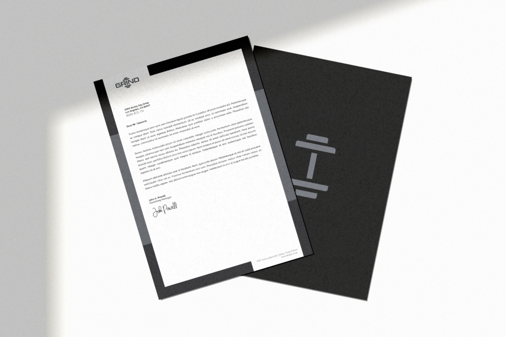
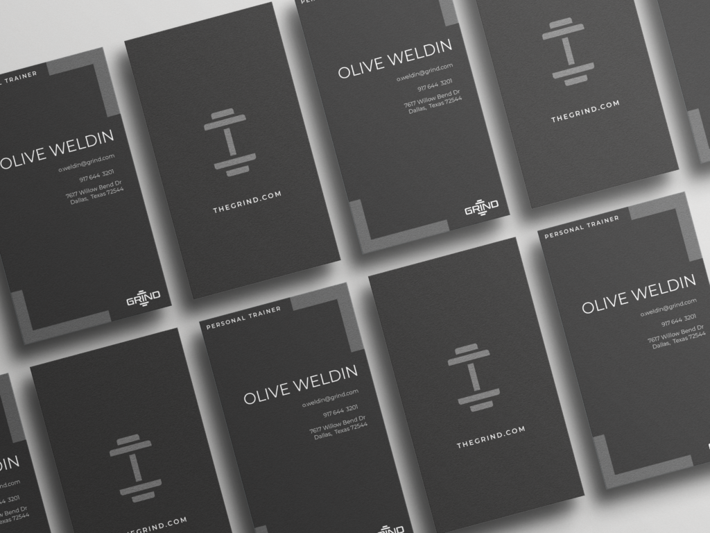
The right angle shapes that frame the letterhead help reinforce the concept of strength and rigor with their structured movement. The logo and the contact information functionally fits in the break between the borders providing a kind of functional continuity.
The Extension
Althetic Clothing Line of the Company
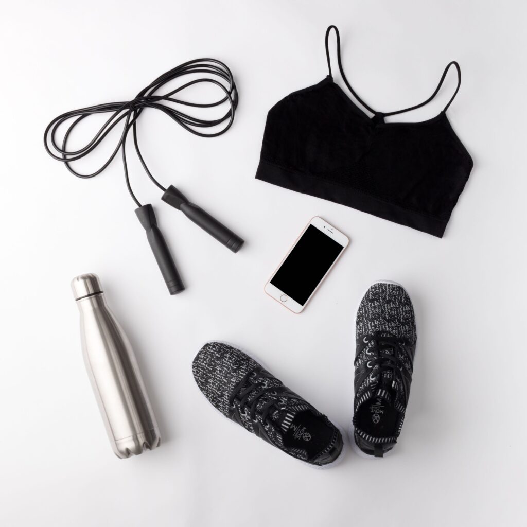
Ad Campaign
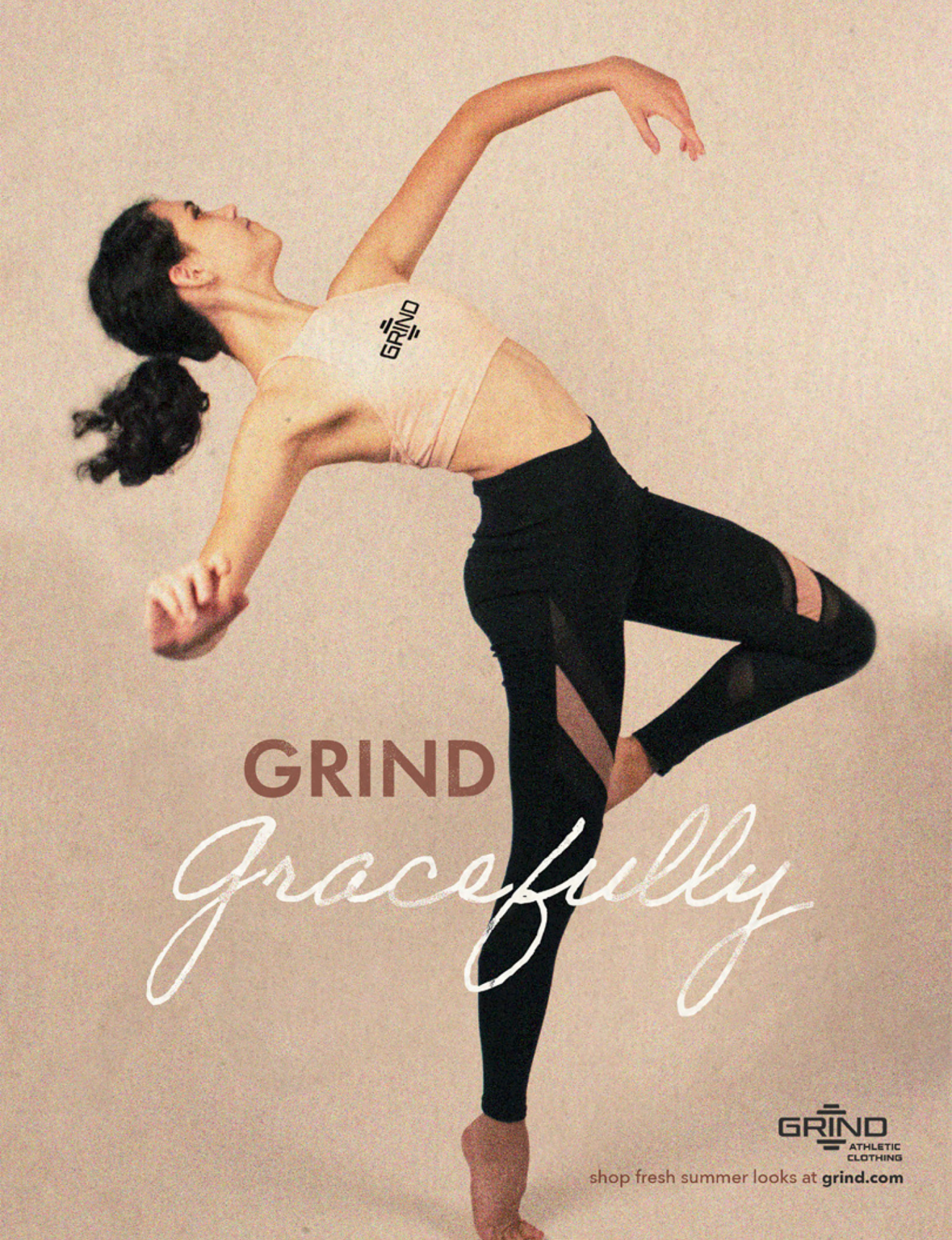
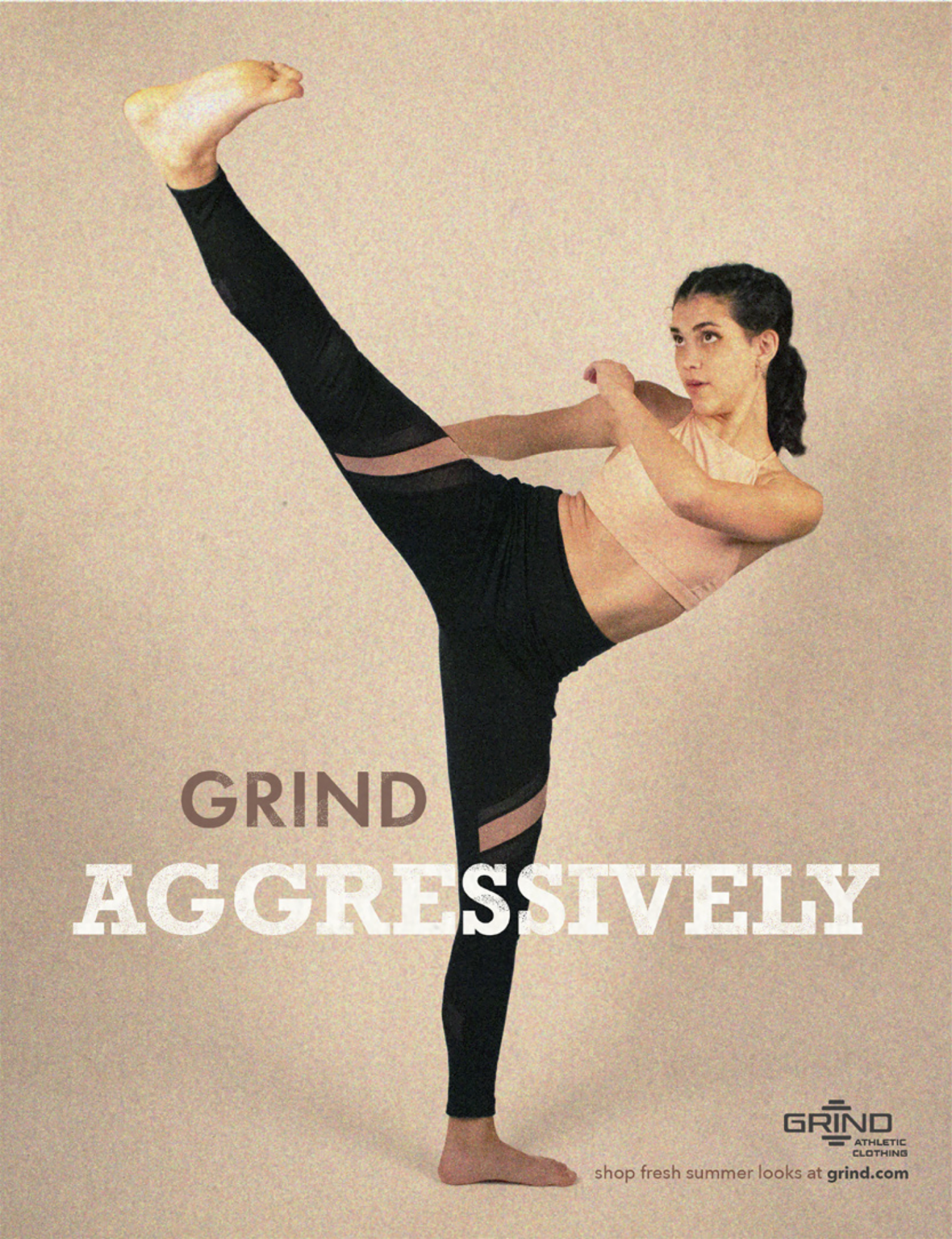
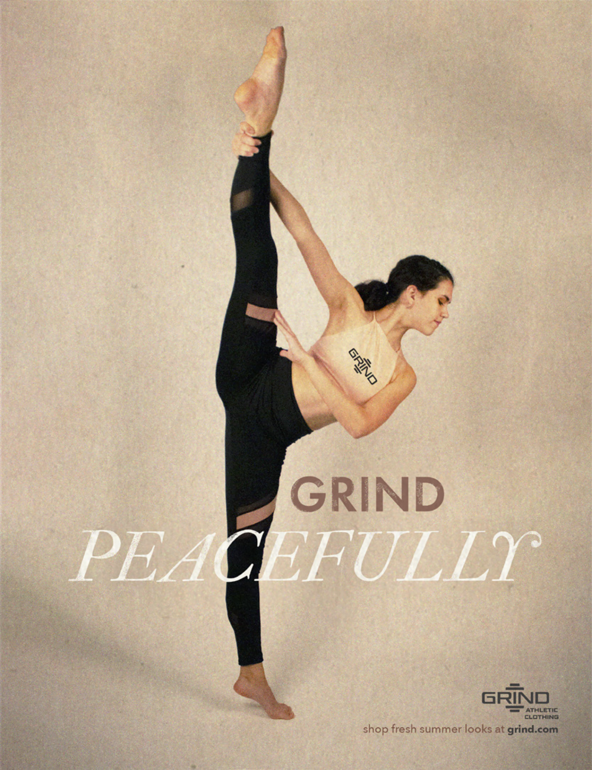
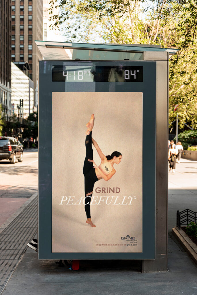
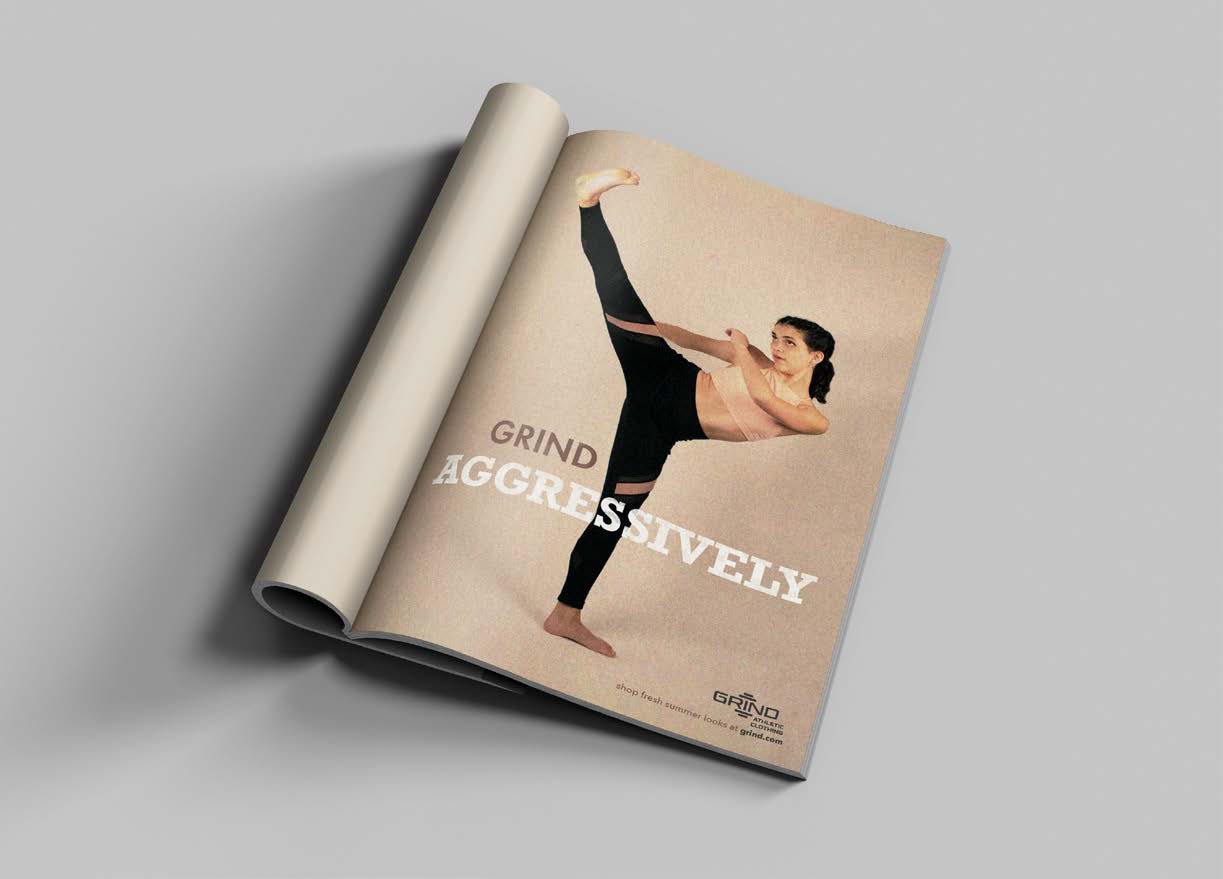
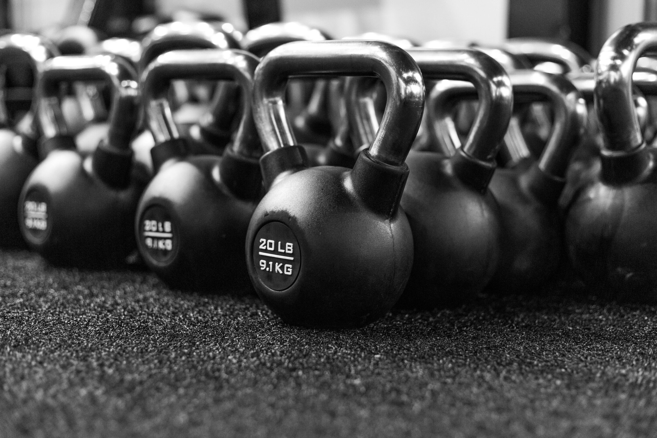
Grind Athletic Clothing’s ad campaign was inspired by the mid to late 20th-century print ads with grainy photography. The purpose of the customers can feel comfortable being active in different ways in the clothing.
– Photography and Design by me.

